General Guidelines
Desktop/Web
- Browser Support
- Windows
- Installers
- Consoles
- Dashboards
- Workspaces
- Navigation
- Forms
- Validation
- Error Messages
- Labels/Required Fields
- href="forms-inline-messaging.php">Inline Messaging
- Edit in Place
- Status/Progress Indicators
- Tab Indexes
- Input Prompts
- Selection
- Disabled Fields
- Structured Format
- Search
- Grids/Tables
- Dialog Boxes
- Modals
- SuperBox
- Wizards
- Messages
- Progressive Disclosure
- UI Controls
- UI Text (IDD)
- Data Visualization
Mobile (Tablet & Phone)
- Resolutions
- Gestures
- Touch
- UI Controls
- Buttons
- Check Boxes
- Color Picker
- Date Picker/Calendar
- Drop Down List
- Combo Box
- Groups and Separators
- Links
- List Boxes
- Progress Indicators
- Radio Buttons
- Scrollbars
- Sliders
- href="mobile-snap-drag-controls.php">Snap-Drag Controls
- Spin Controls
- Status Indicators
- Text Boxes
- Toolbars
- Screen Orientation
- Page Composition
- Display of Information
- Control and Confirmation
- Revealing More
- Widgets
- Input and Output
- Input Method Indicator
- Autocomplete and Prediction
- href="mobile-directional-entry.php">Directional Entry
- Press and Hold
- Focus and Cursors
- Input Areas
- Form Selections
- Mechanical Style Controls
- Clear Entry
- Tones
- Voice Input
- Voice Readback
- Voice Notifications
- Haptic Output
Visual Design Guidelines
Dashboard - Overview, and the Use of Panes
Problem
An application serves up a variety of complex data, often from different resources. The amount of data can be overwhelming to the user.
Solution
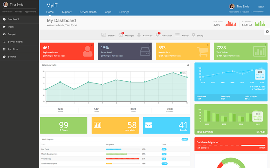
Arrange data displays into a single information-dense page, organized through the use of panes. Show users relevant, actionable information and let them customize the display as necessary.
A dashboard-pane model serves as a quick introduction to an application revealing capabilities and proactively highlighting new content. The dashboard is full-screen, and its panes can be organized by:
- Features
- Categories
- Accounts
The pane-based dashboard (a type of portal) combines business intelligence systems and browser-based applications to summarize the status of a complex enterprise for decision-makers. Like all portals, dashboards integrate a variety of content and functionality. Integration lowers the acquisition costs of finding items from multiple sources. It also increases the value of each individual tool and content asset through grouping to help decision-making and understanding.
Why
The dashboard is a familiar and recognizable page style. Users have well-established expectations about how they work; they show useful information, they update themselves, they usually use graphics to display data, etc.
A dashboard is also an assembly of interlocking patterns and components. Many online dashboards use these in predictable ways:
- Tiled Sections
- Tabs and Collapsible Panels
- Movable Panels
- One-Window Drilldown
- Lists and Tables of various kinds
- Row Striping
- Information Graphics
- Datatips
Use When
Include a dashboard when the application deals with an incoming flow of information from something - web server data, social chatter, business intelligence information or financials, for example. Users would benefit from continuous monitoring of that information.
How to Use
Determine what information users need or want to see. Remove, or at least de-emphasize, information that doesn't help the user.
Use good visual hierarchy to arrange lists, tables, and information graphics on the page. Try to keep the main information on one page, with little or no scrolling, so people can keep the window on-screen and see everything at a glance. Group related data into Tiled Sections, and use tabs only when you're confident that users won't need to see the tab contents side by side.
Use one-window drilldown to let users see additional details about the data - they should be able to click on links or graphics to find out more. Datatips work well to show individual data points when the cursor rolls over an information graphic.
Choose appropriate and well designed information graphics for the data you need to show. Guages, dials, pie charts and 3D bar charts look nice, but they are rarely the best way to show comparative information at a glance; simple line and bar charts express data better, especially time-based data. When numbers and text are more relevant than graphics, use lists and tables. row striping is a common pattern for multicolumn data tables.
People will try to get actionable information from the dashboard at a glance, without looking hard at every element on the page. So when you show text, consider highlighting keywords and numbers so that they stand out from surrounding text. Your users should be able tocustomize their dashboard - most dashboards do offer customization, and the user my expect this. Customization options may include re-ordering of tile panels, applying themes, modifying what data is displayed or adding widgets.
Examples
