HTML code here
General Guidelines
Desktop/Web
- Browser Support
- Windows
- Installers
- Consoles
- Dashboards
- Workspaces
- Navigation
- Forms
- Validation
- Error Messages
- Labels/Required Fields
- href="forms-inline-messaging.php">Inline Messaging
- Edit in Place
- Status/Progress Indicators
- Tab Indexes
- Input Prompts
- Selection
- Disabled Fields
- Structured Format
- Search
- Grids/Tables
- Dialog Boxes
- Modals
- SuperBox
- Wizards
- Messages
- Progressive Disclosure
- UI Controls
- UI Text (IDD)
- Data Visualization
Mobile (Tablet & Phone)
- Resolutions
- Gestures
- Touch
- UI Controls
- Buttons
- Check Boxes
- Color Picker
- Date Picker/Calendar
- Drop Down List
- Combo Box
- Groups and Separators
- Links
- List Boxes
- Progress Indicators
- Radio Buttons
- Scrollbars
- Sliders
- href="mobile-snap-drag-controls.php">Snap-Drag Controls
- Spin Controls
- Status Indicators
- Text Boxes
- Toolbars
- Screen Orientation
- Page Composition
- Display of Information
- Control and Confirmation
- Revealing More
- Widgets
- Input and Output
- Input Method Indicator
- Autocomplete and Prediction
- href="mobile-directional-entry.php">Directional Entry
- Press and Hold
- Focus and Cursors
- Input Areas
- Form Selections
- Mechanical Style Controls
- Clear Entry
- Tones
- Voice Input
- Voice Readback
- Voice Notifications
- Haptic Output
Visual Design Guidelines
Date Picker Calendar
Problem
Dates are notorious for having many possible representations varying by locale and personal preference.
Solution
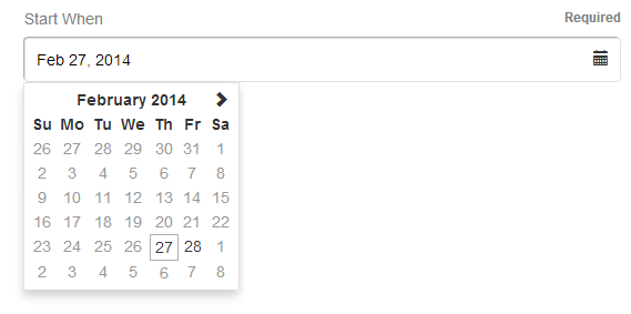
Provide a visual representation of dates in the familiar calendar format to facilitate people entering dates in a consistent format.

Why
Date pickers provide a familiar calendar metaphor that resonates with most people and it helps them to think about dates in terms of where they are in the month and week. They help structure the date input in a way that your system can interpret reliably, thereby reducing validation errors caused by unrecognized date formats, and they are easier to use than multiple drop down choosers with, e.g., month, day, year.
How
As with most complex controls, it is often your best bet to look for third parties who have already implemented the control for your platform (if the platform itself doesn't support it). But the key elements of a date picker are the month view (as a calendar), the ability to select a day in a month, and the ability to navigate between months.
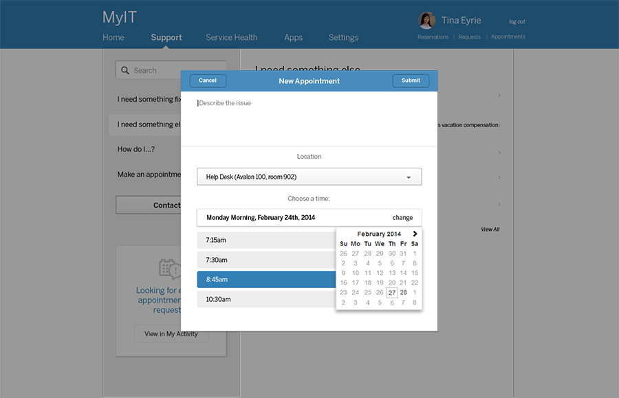
It is fairly common to only show the date picker on demand as a Drop Down Chooser. This is because there is no need to take up all that space and attention except when the person wants to actually pick a date. Similarly, the affordance to indicate the picker is usually a calendar icon with a down arrow, though both are optional if, for instance, you activate the picker when the field is given focus, but showing at least one of the affordances is helpful unless your users expect the drop down.
When showing the calendar, it is common to show the month for the currently-selected date and highlight that date in the calendar itself. If no date is selected, showing the current month is a good default, unless you can infer a better starting point based on the context for the date being selected. It can be helpful to show the current date highlighted as well to provide a bit of extra orientation. In terms of changing months, it's pretty common to show left and right arrows, with left meaning prior and right meaning next to let people navigate between months. It is also fairly common to show a Drop Down Chooser for changing the year, though there are better alternatives such as that shown in the Vista system clock example.
Clicking on a day in the drop down selects that date and closes the drop down; closing when a user clicks outside of the calendar or tabs away from the field can be a good option as well, but definitely provide a close command to hide it if you don't do that.
You may also want to consider, if you have confidence in your target audience or in your system's ability to cope with unexpected formats, allowing people to enter a date directly in addition to the date picker. More advanced users and cases of high data entry (where context switching between mouse and keyboard are costly) should be able to bypass helpers like the date picker.
Similarly, depending on the kind of date (such as date of birth), date pickers may not be the optimal choice due to the amount of effort to navigate to a distant date in the past. In those cases, it may be better to provide multiple drop down choosers for month, day, and year unless you can provide an easy way to navigate larger time spans. Often letting people type in their DOB directly is the best option.
Examples
