HTML code here
General Guidelines
Desktop/Web
- Browser Support
- Windows
- Installers
- Consoles
- Dashboards
- Workspaces
- Navigation
- Forms
- Validation
- Error Messages
- Labels/Required Fields
- href="forms-inline-messaging.php">Inline Messaging
- Edit in Place
- Status/Progress Indicators
- Tab Indexes
- Input Prompts
- Selection
- Disabled Fields
- Structured Format
- Search
- Grids/Tables
- Dialog Boxes
- Modals
- SuperBox
- Wizards
- Messages
- Progressive Disclosure
- UI Controls
- UI Text (IDD)
- Data Visualization
Mobile (Tablet & Phone)
- Resolutions
- Gestures
- Touch
- UI Controls
- Buttons
- Check Boxes
- Color Picker
- Date Picker/Calendar
- Drop Down List
- Combo Box
- Groups and Separators
- Links
- List Boxes
- Progress Indicators
- Radio Buttons
- Scrollbars
- Sliders
- href="mobile-snap-drag-controls.php">Snap-Drag Controls
- Spin Controls
- Status Indicators
- Text Boxes
- Toolbars
- Screen Orientation
- Page Composition
- Display of Information
- Control and Confirmation
- Revealing More
- Widgets
- Input and Output
- Input Method Indicator
- Autocomplete and Prediction
- href="mobile-directional-entry.php">Directional Entry
- Press and Hold
- Focus and Cursors
- Input Areas
- Form Selections
- Mechanical Style Controls
- Clear Entry
- Tones
- Voice Input
- Voice Readback
- Voice Notifications
- Haptic Output
Visual Design Guidelines
Group Separators
Problem
People get overwhelmed if too much information is presented at once.
Solution
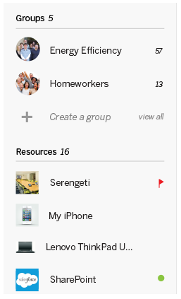
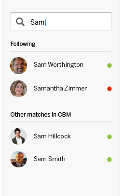
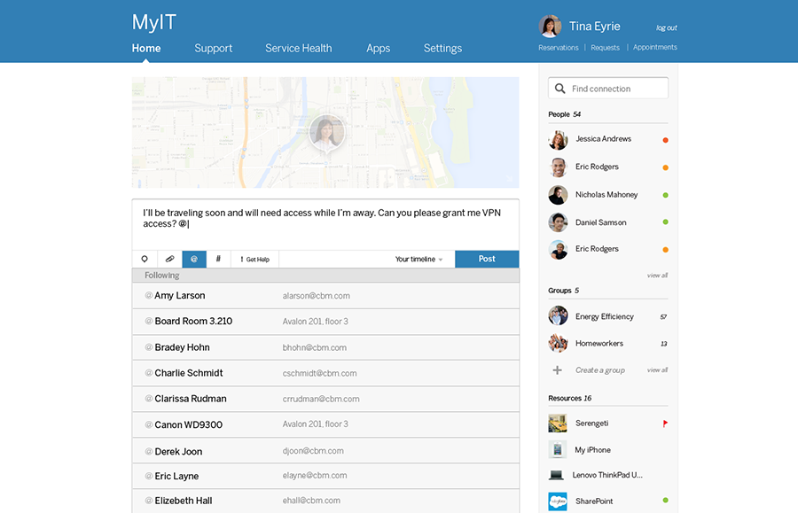
Group information into sections on a view and add prominent titles to them.


Why
Psychological studies have proven that people are better able to absorb (and remember) information if it is broken down into smaller chunks. In fact, it is sort of a primordial basis of classifying information. The same principle applies for information you put into your solutions to be seen by your users - break stuff down into meaningful groups and label them.
Using visually distinct sections will guide people to see the information as chunks. The titles will help them to quickly scan over the chunks to find what is interesting to them, and then they can look deeper at the section if interested.
Code
CSS code here
How
This pattern will be problematic if the information cannot be logically grouped into chunks. Use few words that concisely communicate the contents of the section.
Consideration needs to be given to how to layout the sections. Usually, using white space as gutters to set them off is better than lines, boxes, or background colors (because those add visual noise), though these can help if used strategically or if they fit better with the overall design. Sections may go side by side, top to bottom, or maybe both. They could also be presented as floating tiles that can adjust in a Liquid Layout; whether or not they flow, Grid Layout is most likely the best choice for overall layout.
Titles should be visibly prominent, which usually means a larger font, and maybe a different color. Using icons with the titles to further set them off is also acceptable.
Examples
