HTML code here
General Guidelines
Desktop/Web
- Browser Support
- Windows
- Installers
- Consoles
- Dashboards
- Workspaces
- Navigation
- Forms
- Validation
- Error Messages
- Labels/Required Fields
- href="forms-inline-messaging.php">Inline Messaging
- Edit in Place
- Status/Progress Indicators
- Tab Indexes
- Input Prompts
- Selection
- Disabled Fields
- Structured Format
- Search
- Grids/Tables
- Dialog Boxes
- Modals
- SuperBox
- Wizards
- Messages
- Progressive Disclosure
- UI Controls
- UI Text (IDD)
- Data Visualization
Mobile (Tablet & Phone)
- Resolutions
- Gestures
- Touch
- UI Controls
- Buttons
- Check Boxes
- Color Picker
- Date Picker/Calendar
- Drop Down List
- Combo Box
- Groups and Separators
- Links
- List Boxes
- Progress Indicators
- Radio Buttons
- Scrollbars
- Sliders
- href="mobile-snap-drag-controls.php">Snap-Drag Controls
- Spin Controls
- Status Indicators
- Text Boxes
- Toolbars
- Screen Orientation
- Page Composition
- Display of Information
- Control and Confirmation
- Revealing More
- Widgets
- Input and Output
- Input Method Indicator
- Autocomplete and Prediction
- href="mobile-directional-entry.php">Directional Entry
- Press and Hold
- Focus and Cursors
- Input Areas
- Form Selections
- Mechanical Style Controls
- Clear Entry
- Tones
- Voice Input
- Voice Readback
- Voice Notifications
- Haptic Output
Visual Design Guidelines
Toolbars
Problem
Users require constant access to useful functions that need to be quickly accessible without scrolling. T
Solution
Consolidate these functions into a toolbar that persists across screens, and is easily accessible.


Why
Fixed toolbars contain functions which are:
- commonly used
- useful
- promotional
- branding fixed elements
Toolbar functions that need to be accessed at any time, with direct or indirect relation to the context on the page. The functions are accessible from a fixed position on the screen that holds its fixed position if the page is scrolled.
How
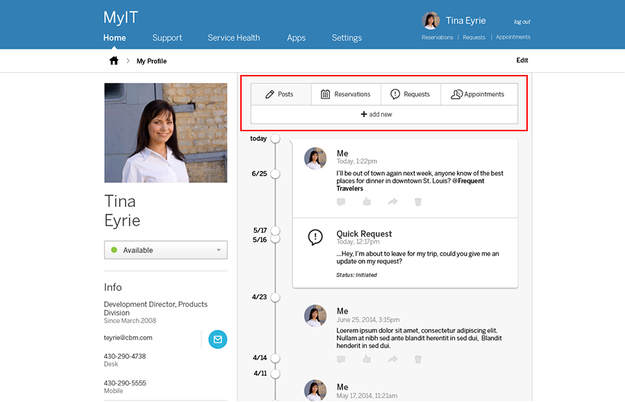
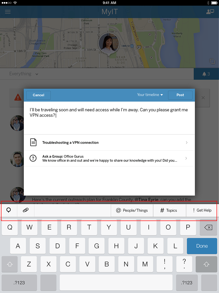
The toolbar can be composed of many elements: icons (if conventional and understood by users), pulldown menus, links, textfields, etc.
- The toolbar could be present on almost all pages on your site, or only on pages where it makes sense.
- Caution should be used when considering including toolbars; they take up space, especially on mobile devices. More scrolling is needed to uncover the part of the page that it obscures.
- The toolbar should be as small as possible. If a horizontal toolbar is being considered, minimize its height. If the toolbar is vertical, minimize its width.
- Provide a "close" option so that users can choose to collapse the toolbar if they find it more annoying than useful. Consider how and when to show the toolbar again.
- Add tooltips or contextual help to facilitate learning to encourage
Examples

