General Guidelines
Desktop/Web
- Browser Support
- Windows
- Installers
- Consoles
- Dashboards
- Workspaces
- Navigation
- Forms
- Validation
- Error Messages
- Labels/Required Fields
- href="forms-inline-messaging.php">Inline Messaging
- Edit in Place
- Status/Progress Indicators
- Tab Indexes
- Input Prompts
- Selection
- Disabled Fields
- Structured Format
- Search
- Grids/Tables
- Dialog Boxes
- Modals
- SuperBox
- Wizards
- Messages
- Progressive Disclosure
- UI Controls
- UI Text (IDD)
- Data Visualization
Mobile (Tablet & Phone)
- Resolutions
- Gestures
- Touch
- UI Controls
- Buttons
- Check Boxes
- Color Picker
- Date Picker/Calendar
- Drop Down List
- Combo Box
- Groups and Separators
- Links
- List Boxes
- Progress Indicators
- Radio Buttons
- Scrollbars
- Sliders
- href="mobile-snap-drag-controls.php">Snap-Drag Controls
- Spin Controls
- Status Indicators
- Text Boxes
- Toolbars
- Screen Orientation
- Page Composition
- Display of Information
- Control and Confirmation
- Revealing More
- Widgets
- Input and Output
- Input Method Indicator
- Autocomplete and Prediction
- href="mobile-directional-entry.php">Directional Entry
- Press and Hold
- Focus and Cursors
- Input Areas
- Form Selections
- Mechanical Style Controls
- Clear Entry
- Tones
- Voice Input
- Voice Readback
- Voice Notifications
- Haptic Output
Visual Design Guidelines
Data Visualization - Bar Charts
Overview
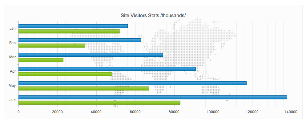
Bar charts are used to visualize absolute magnitudes of nominal data items. They can theoretically consist only a single data item, but in most cases are used to additionally compare the quantitative value of several entities with each other. Bar charts as a major group of standard display are distinguished charts from line charts and pie charts as they do not display continuos developments over an interval but measure the values of discrete data items. Also, they display absolute numerical values rather than proportions.
Solution
Bar charts are, besides line and pie charts the most common data visualization technique and find wide usage in popular statistics. They are useful to compare several quantitative entities of a common class. The substantial information provided by a bar chart is the relationship of several data items belonging to a common group or class in terms of magnitude.
Why
Bar charts are used to visualize absolute magnitudes of nominal data items. They can theoretically consist only a single data item, but in most cases are used to additionally compare the quantitative value of several entities with each other. Bar charts as a major group of standard display are distinguished charts from line charts and pie charts as they do not display continuos developments over an interval but measure the values of discrete data items. Also, they display absolute numerical values rather than proportions.
How
Create a Cartesian coordinate system. Divide and label the y-axis so that the magnitude of each item lies within the available scale. Separate the x-axis into regular segments, and attach to each of these segments one of the data items you want to display. For each data item, attach a vertical rectangle above the corresponding label on the x-axis and adjust its height according to the data value it represents.
