General Guidelines
Desktop/Web
- Browser Support
- Windows
- Installers
- Consoles
- Dashboards
- Workspaces
- Navigation
- Forms
- Validation
- Error Messages
- Labels/Required Fields
- href="forms-inline-messaging.php">Inline Messaging
- Edit in Place
- Status/Progress Indicators
- Tab Indexes
- Input Prompts
- Selection
- Disabled Fields
- Structured Format
- Search
- Grids/Tables
- Dialog Boxes
- Modals
- SuperBox
- Wizards
- Messages
- Progressive Disclosure
- UI Controls
- UI Text (IDD)
- Data Visualization
Mobile (Tablet & Phone)
- Resolutions
- Gestures
- Touch
- UI Controls
- Buttons
- Check Boxes
- Color Picker
- Date Picker/Calendar
- Drop Down List
- Combo Box
- Groups and Separators
- Links
- List Boxes
- Progress Indicators
- Radio Buttons
- Scrollbars
- Sliders
- href="mobile-snap-drag-controls.php">Snap-Drag Controls
- Spin Controls
- Status Indicators
- Text Boxes
- Toolbars
- Screen Orientation
- Page Composition
- Display of Information
- Control and Confirmation
- Revealing More
- Widgets
- Input and Output
- Input Method Indicator
- Autocomplete and Prediction
- href="mobile-directional-entry.php">Directional Entry
- Press and Hold
- Focus and Cursors
- Input Areas
- Form Selections
- Mechanical Style Controls
- Clear Entry
- Tones
- Voice Input
- Voice Readback
- Voice Notifications
- Haptic Output
Visual Design Guidelines
Mobile - Touch Interaction Guidelines
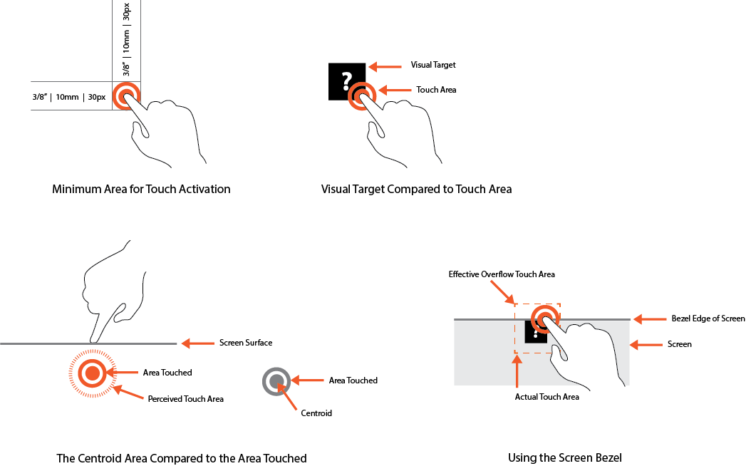
The minimum area for touch activation is a square 3/8 of an inch on each side, or 10mm, or 30px by 30px. Wherever possible use larger target areas.
There is no distinct preference for vertical or horizontal finger touch areas. All touch can be assumed to be a circle, although the actual input item may be shipped as needed to fit the space, or express a preconceived notion.
Targets
The visual target is not always the same as the touch area. However, the touch area may never be smaller than the visual target. When practical (i.e., there is no adjacent interactive item), the touch area should be notably larger than the visual target, filling the white space between objects. Some dead space should often be provided so that edge contact does not result in improper input.
The orange dotted line in the diagram below is the touch area. It is notably larger than the visual target, so a missed touch still functions as expected.
Touch Area and the Centroid of Contact
The point activated by a touch is the centroid of the touched area; that area where the user's finger is flat against the screen.
The centroid is the center of the area whose coordinates are the average of the coordinates of all the points of the shape. This may be sensed directly or calculated.
A larger area will typically be perceived to have been touched by the uer due to parallax (advanced users may become aware of the centroid phenomenon, and expect this).
Bezels, Edges and Size Cheats
Buttons at the edges of screens with flat bezels may take advantage of this to use smaller target sizes. The user may place their finger so that part of the touch is on the bezel (off the sensing area of the screen). This will effectively reduce the size of their finger, and allow smaller input areas.
This effective size reduction can only be about 60% of normal and only in the dimension with the edge condition. This is most useful in giving high priority items a larger target size without increasing the apparent or on-screen size of the target or touch area.
For mobile devices we know that screen display size is limited and its space is valuable. In addition, mobile device users require quick access to the content they are looking for. Using the following constraints may help the user experience:
- Buttons and selectable controls should be an appropriate size since it is relatively difficult on small implementations. Using the screen bezel overflow can provide a trick for allowing smaller, yet highly selectable targets. For touch devices with a flat bezel, the user may place part of their finger off the screen and activate a much smaller target than usual.
- Popups and tooltips can usually be opened or activated faster than pull-down menus, since the user avoids travel.
- Reduce the number of taps to access content by providing surface-level sorting and filtering controls to access indexed information quickly.
Illustrations
