General Guidelines
Desktop/Web
- Browser Support
- Windows
- Installers
- Consoles
- Dashboards
- Workspaces
- Navigation
- Forms
- Validation
- Error Messages
- Labels/Required Fields
- href="forms-inline-messaging.php">Inline Messaging
- Edit in Place
- Status/Progress Indicators
- Tab Indexes
- Input Prompts
- Selection
- Disabled Fields
- Structured Format
- Search
- Grids/Tables
- Dialog Boxes
- Modals
- SuperBox
- Wizards
- Messages
- Progressive Disclosure
- UI Controls
- UI Text (IDD)
- Data Visualization
Mobile (Tablet & Phone)
- Resolutions
- Gestures
- Touch
- UI Controls
- Buttons
- Check Boxes
- Color Picker
- Date Picker/Calendar
- Drop Down List
- Combo Box
- Groups and Separators
- Links
- List Boxes
- Progress Indicators
- Radio Buttons
- Scrollbars
- Sliders
- href="mobile-snap-drag-controls.php">Snap-Drag Controls
- Spin Controls
- Status Indicators
- Text Boxes
- Toolbars
- Screen Orientation
- Page Composition
- Display of Information
- Control and Confirmation
- Revealing More
- Widgets
- Input and Output
- Input Method Indicator
- Autocomplete and Prediction
- href="mobile-directional-entry.php">Directional Entry
- Press and Hold
- Focus and Cursors
- Input Areas
- Form Selections
- Mechanical Style Controls
- Clear Entry
- Tones
- Voice Input
- Voice Readback
- Voice Notifications
- Haptic Output
Visual Design Guidelines
Data Visualization - Line Charts
Overview
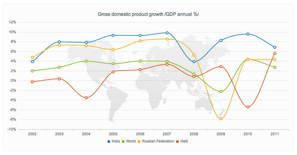
Line charts display the quantitative value of an observed object over a continuous interval. In most cases, this interval is a time span, and the graph describes how the object’s variable changes over this time interval. The line chart is a widely used diagram type, and due to its familiar structure easy to grasp. Besides the individual values themselves the most significant information that can be derived from it is the gradient of the curve, which provides information about the intensity of the attribute’s change over time. Also, minimum and maximum values can be easily identified from such a representation.
Solution
Use the simple line chart to display pairs of numerical values derived from tabular data. As a specific feature of line charts, there is basically no free choice of which variable is assigned to which axis in the coordinate system. Instead, one of the two variables should be scaled on an interval, meaning it consists of a regular, continuous series of numbers. This variable is called the independent variable, and usually referred to as the x-variable. Each of these independent variables in the table has a certain y-value assigned to it: The dependent variable. With the independent variable applied to the horizontal axis in the coordinate grid, the chart consists of a set of points with regular distances to their respective neighbors. The points are then connected by a line that represents a continuous development of the value, even if only punctual values are known from the table. The accuracy of the graph depends on the density of points in the coordinate grid.

Why
Set within a Cartesian coordinate system, line charts are one of the most common and most widely used diagram types. The expressive power of this type of infographic lies in the user’s ability to interpret the development of a magnitude over an interval, such as time, by merely looking at the way the graph line “moves” from left to right. Even without detailed information at hand, a quick glance at the “big picture“ provides valuable insight to the data already.
How
Create a two-dimensional Cartesian coordinate system. Label and subdivide the two axes according to the variables’ scales and units with the independent variable assigned to the x-axis. For each row in the table (i.e. for each pair of variates), draw a point at the corresponding coordinates in the coordinate pane. Connect the points with each other through a continuous line from left to right. The result of this process is a line or curve that reflects an approximation of the dependent variable’s development over the interval of the independent variable. The smaller the distance between two neighboring points, the higher the graph’s accuracy.