General Guidelines
Desktop/Web
- Browser Support
- Windows
- Installers
- Consoles
- Dashboards
- Workspaces
- Navigation
- Forms
- Validation
- Error Messages
- Labels/Required Fields
- href="forms-inline-messaging.php">Inline Messaging
- Edit in Place
- Status/Progress Indicators
- Tab Indexes
- Input Prompts
- Selection
- Disabled Fields
- Structured Format
- Search
- Grids/Tables
- Dialog Boxes
- Modals
- SuperBox
- Wizards
- Messages
- Progressive Disclosure
- UI Controls
- UI Text (IDD)
- Data Visualization
Mobile (Tablet & Phone)
- Resolutions
- Gestures
- Touch
- UI Controls
- Buttons
- Check Boxes
- Color Picker
- Date Picker/Calendar
- Drop Down List
- Combo Box
- Groups and Separators
- Links
- List Boxes
- Progress Indicators
- Radio Buttons
- Scrollbars
- Sliders
- href="mobile-snap-drag-controls.php">Snap-Drag Controls
- Spin Controls
- Status Indicators
- Text Boxes
- Toolbars
- Screen Orientation
- Page Composition
- Display of Information
- Control and Confirmation
- Revealing More
- Widgets
- Input and Output
- Input Method Indicator
- Autocomplete and Prediction
- href="mobile-directional-entry.php">Directional Entry
- Press and Hold
- Focus and Cursors
- Input Areas
- Form Selections
- Mechanical Style Controls
- Clear Entry
- Tones
- Voice Input
- Voice Readback
- Voice Notifications
- Haptic Output
Visual Design Guidelines
Mobile - Input Areas
Problem
A method must be provided for users to enter text and other character-based information without restriction.
Solution
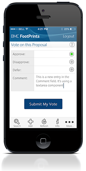
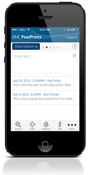
Text and textarea input fields are heavily used to accept user-generated text input in all types of computing.
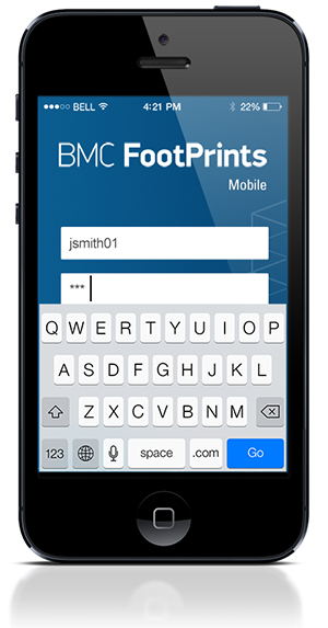
Text input areas may only be used while in focus. Focus can be attained by scrolling with Directional Entry keys or by direct selection with a pen of finger.
While a field is in focus, pressing the "OK/Enter" key (when available) will commit the field and transfer focus to the next field (ready for entry) or to the next item in the list. If no other item is available, the entire form will be submitted.
Whenever content is known by the system pre-populate the input areas so the user doesn't have to enter the information.
Field focus must be very clearly delineated with a border, background or other effect. An Input Method Indicator of some sort should be used to denote the available text entry modes.
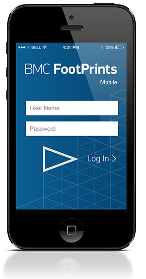
Fields should always be labeled. The format of the labels should be different from other text on the screen to help clarify to the user; for example, labels could be italicized, or assigned a different color. Labels can be positioned inside the input area in order to maximize the viewport real estate. When a input area receives focus, the label disappears and is replaced with a caret. If room permits, labels may reside outside the input area, preferably to the top, flush left with the input area.
Hint text can also be used within the input area in combination with labels living outside the input area. Hint text gives the user some additional information concerning the type of input required; the hint text disappears when the input area receives focus, and re-appears with the input area loses focus without any input entered.
Validate forms at the field level whenever possible. Validation for each field can be indicated adjacent to the field using a small icon to indicate success or failure.
Use supporting patterns such as Autocomplete & Prediction to make entry more efficient.
Examples


