HTML code here
General Guidelines
Desktop/Web
- Browser Support
- Windows
- Installers
- Consoles
- Dashboards
- Workspaces
- Navigation
- Forms
- Validation
- Error Messages
- Labels/Required Fields
- href="forms-inline-messaging.php">Inline Messaging
- Edit in Place
- Status/Progress Indicators
- Tab Indexes
- Input Prompts
- Selection
- Disabled Fields
- Structured Format
- Search
- Grids/Tables
- Dialog Boxes
- Modals
- SuperBox
- Wizards
- Messages
- Progressive Disclosure
- UI Controls
- UI Text (IDD)
- Data Visualization
Mobile (Tablet & Phone)
- Resolutions
- Gestures
- Touch
- UI Controls
- Buttons
- Check Boxes
- Color Picker
- Date Picker/Calendar
- Drop Down List
- Combo Box
- Groups and Separators
- Links
- List Boxes
- Progress Indicators
- Radio Buttons
- Scrollbars
- Sliders
- href="mobile-snap-drag-controls.php">Snap-Drag Controls
- Spin Controls
- Status Indicators
- Text Boxes
- Toolbars
- Screen Orientation
- Page Composition
- Display of Information
- Control and Confirmation
- Revealing More
- Widgets
- Input and Output
- Input Method Indicator
- Autocomplete and Prediction
- href="mobile-directional-entry.php">Directional Entry
- Press and Hold
- Focus and Cursors
- Input Areas
- Form Selections
- Mechanical Style Controls
- Clear Entry
- Tones
- Voice Input
- Voice Readback
- Voice Notifications
- Haptic Output
Visual Design Guidelines
Navigation Fly-Out Drawers
Problem
Users need to have direct access to sub-navigation but the amount of screen estate for navigation is limited .
Solution
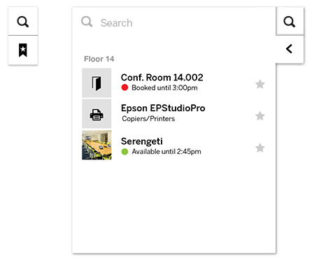
Combine horizontal navigation with a sub-menu that flies-out when the users hovers over the main menu-item


Use When
For experienced users who want quick access to menu items. Typically there is a main page and all clickable items are grouped under a label. The menu items themselves do not link to a page. Space for navigation is limited, if not consider other navigation systems such as a Directory Navigation. Menu items should be found always in the same spot. The number of mouse-clicks should be minimized. No reload of pages is necessary.
Code
CSS code here
Why
Fly-out menus can work well but they may also kill usability. The actual implementation is crucial for its success. On the one hand, fly-out menus save space that may be used better for the content area of the site. But on the other hand it hides the navigation from first sight. It is a kind of 'mystery-meat navigation'. If executed well it provides very quick access to sections in the site without cluttering up the screen estate with navigation. When users become accustomed to the fly-out menu, its advantages will prove quite useful. On the other hand, for one-off interactions it may cause usability issues.
How
On mouse-over show the menu. The menu always directly moves up, down or right (never left) in such a way that it does not cover the other menu items. The flying-out should be instant or very quick otherwise users cannot switch quickly. Preferable combined with a Breadcrumbs. The fly-out menu may exist horizontally or vertically.
Examples
