General Guidelines
Desktop/Web
- Browser Support
- Windows
- Installers
- Consoles
- Dashboards
- Workspaces
- Navigation
- Forms
- Validation
- Error Messages
- Labels/Required Fields
- href="forms-inline-messaging.php">Inline Messaging
- Edit in Place
- Status/Progress Indicators
- Tab Indexes
- Input Prompts
- Selection
- Disabled Fields
- Structured Format
- Search
- Grids/Tables
- Dialog Boxes
- Modals
- SuperBox
- Wizards
- Messages
- Progressive Disclosure
- UI Controls
- UI Text (IDD)
- Data Visualization
Mobile (Tablet & Phone)
- Resolutions
- Gestures
- Touch
- UI Controls
- Buttons
- Check Boxes
- Color Picker
- Date Picker/Calendar
- Drop Down List
- Combo Box
- Groups and Separators
- Links
- List Boxes
- Progress Indicators
- Radio Buttons
- Scrollbars
- Sliders
- href="mobile-snap-drag-controls.php">Snap-Drag Controls
- Spin Controls
- Status Indicators
- Text Boxes
- Toolbars
- Screen Orientation
- Page Composition
- Display of Information
- Control and Confirmation
- Revealing More
- Widgets
- Input and Output
- Input Method Indicator
- Autocomplete and Prediction
- href="mobile-directional-entry.php">Directional Entry
- Press and Hold
- Focus and Cursors
- Input Areas
- Form Selections
- Mechanical Style Controls
- Clear Entry
- Tones
- Voice Input
- Voice Readback
- Voice Notifications
- Haptic Output
Visual Design Guidelines
Data Visualization - Pie Charts
Overview
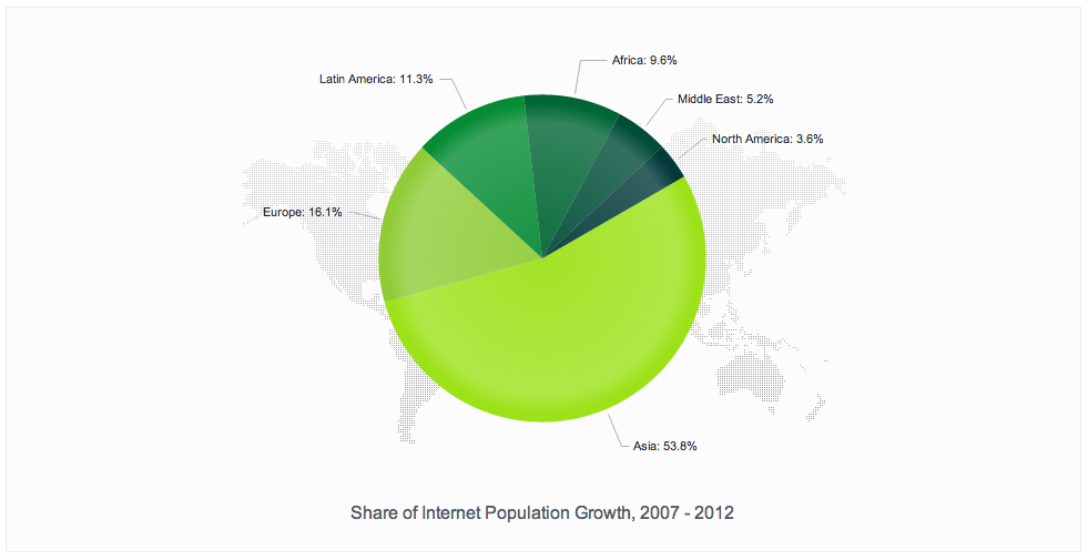
A pie chart is a circular object divided into multiple polar segments. It displays the relative magnitude of several quantitative values compared to each other, or, in other words, the distribution of several values that belong to the same dataset. The full circle represents the total magnitude of this dataset, equal to 100 percent, while each segment stands for the magnitude of one particular variable. Segment area, arc length and arc angle of each segment are proportional to the value the segment represents. The segments of a pie chart are usually labeled with percentage numbers rather than total values (although they can feature both for the sake of understanding).
Solution
Use a pie chart to display a set of categorical items. Each item has a magnitude expressed as a proportional value against the total size of the dataset: The sum of all items’ magnitudes is 100 percent.

Why
Pie charts give the reader a quick idea of the proportional distribution of data. The association between data and representation is evident: The bigger the piece, the larger the data chunk compared to the other ones. As pie charts belong to the most common infographics used in popular media (e.g. to display election results) and build upon a strong metaphor (the cake cut into pieces) they are a reliable way of communicating information when several data items add to a whole.
How
Draw a circle. Divide it into slice-shaped segments between the center and the circle arc, one segment per data item. Assign one specific data item to each segment, and adjust the size of the segments by making each arc (or each arc angle) proportional to the percentage value of the respective item from your dataset. Label the chart segments accordingly.